Photoshop enables me
to change the colour and tone of any of my layers that have an effect on the
appearance of my poster. I am able to change the colour and the tone by
increasing or decreasing the value of sliders on the brightness and contrast
adjuster, hue and saturation adjuster or by changing the levels and curves
adjusters.
To change the
brightness or contrast I go to:
Image > Adjustments >
Brightness/Contrast.
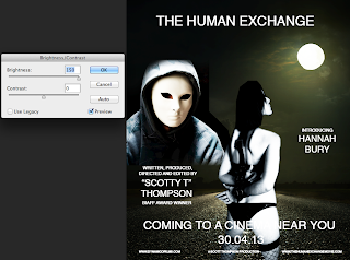
By sliding the image
up to 150 it increases the brightness of the image making elements of the image
appear washed out. Also, some of the outlines of other layers are visible. This
is unusable for my current project as I aim to make, within it’s tone and
treatment a darker, gritty film. I found this option easy to use and can see
the benefits of using it for other projects, but not on this one.
 |
| The Brightness slider has been increased to 150. |
By sliding Brightness
slider down the overall image becomes much darker. This is a more favourable
look for my movie but I am still not entirely enamoured by this because I want to
ensure that the masked man in the image appears as if he is coming out of the
darkness as opposed to hiding in it.
Depending on whether
the contrast slider is increased or decreased the image becomes lighter or
darker respectively. This is because the
values work independently as opposed tom the brightness option where light and
dark works in unison. If the contrast
slider is too high, as shown in the screen shot, the highlights (ie: the
lighter parts of the image) become over exposed and washed out. When the values
of the slider is reduced my image appears a little darker and in this instance
it gave a better look to the image.
Again, I found this
tool an easy option to use and would probably use this as my preferred method
of changing the brightness and contrast on future projects.
To change the hue or
saturation of the image I go to:
By changing the hue
every colour within the image will either get lighter or darker depending on
which way I change the slider. In the screen grab below I have increased the
slider and the images appears more blue. I wouldn’t use this effect as blue
colours usually connote Sci-Fi films and the movie I intend to produce is far
from a space aged adventure.
 |
| The Hue has been increased adding unwanted colour to my image. |
By decreasing the
slider colours still remain, but again this is not a look that I want for my
poster as it does not represent my movie.
 |
| In this image the Hue has been decreased. |
To change the colour
balance of the image I go to:
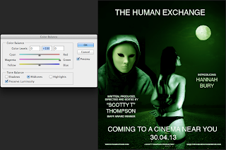
In this option I can
change individual colours that have variant effects on my image by
oversaturating the image with particular colours. In the images shown I have
deliberately oversaturated the images with the following colours; Cyan, Red,
Magenta, Green, Yellow, Blue.
As semiotic analysis
has taught me using blue gives the image a Sci-Fi feel and red gives the image
a look that is more related to a horror movie.
 |
| The blue colour balance has been increased for this image. |
 |
| The cyan colour balance has been increased for this image. |
 |
| The green colour balance has been increased for this image. |
 |
| The magenta colour balance has been increased for this image. |
 |
| The red colour balance has been increased for this image. |
 |
| The yellow colour balance has been increased in this image. |
Another way of
changing the image is by manipulating the levels and curves. To change the
levels I go to:
As the examples show
by moving the sliders up or down I can make the image appear darker or lighter.
I am able to select specific areas of light or dark within the image. In the
examples shown there is a before and after where I have randomly manipulated
the light and contrast. By manipulating the levels I am able to choose the type
of white or black that I wish to change. Due to the ability of selecting
specific areas within an image this is a tool that I would use in the future to
pin point fine tuning within an image I am creating.
 |
| This shows the current levels within my image. |
 |
| This is how my image looks prior to changing the levels. |
 |
| I have changed the levels of the blacks, whites and greys within my image. |
 |
| This is now how my image looks now that the levels have been changed. |
To change the curves I
go to:
By adjusting the
curves I am able to select the whites, greys and blacks of an image. When the
window opens I can manipulate the diagonal line that goes across the box which
changes the contrast levels within the image. Although that this option is very
similar to the levels option it does give me more control by pinpointing a
specific “white” or “black” within the image.
 |
| An image of the curves option. The whites, blacks and greys have not yet been altered. |
 |
| My image again without changes to the curves. |
 |
| Another image of the curves option. Here I have altered the curve to change the whites, blacks and greys. |
Although I didn’t use this advanced method in the creation of my poster I can see how it would be extremely useful and would certainly consider the use of it in further projects.


5.1 Use the Image Adjust facilities for changing colour and tonal values in an image: Brightness and Contrast; Colour Balance; Levels; Curves; Variations. Use the Image Adjust facilities for changing colour and tonal values in an image: Brightness and Contrast; Colour Balance; Levels; Curves; Variations. Critically evaluate the effect
ReplyDeleteG3, G7
You have completed all criteria (1-6) for Introduction to Photoshop.
ReplyDelete